CardGuru
Card Guru
A new website that helps users find the perfect card based on their needs using expert knowledge and reviews.
A new website that helps users find the perfect card based on their needs using expert knowledge and reviews.
CardGuru helps users find the perfect card based on their needs using expert knowledge and reviews.
My Roles

Research

Art Direction

UI Design
UI Design
The Challenges
Time
Our parent company gave the team at Branded Holdings one month to get CardGuru up and running. While we were familiar with the financial space, credit cards were new to us.
Developer Handoff
Previous projects had developers making a lot of assumptions when it came to writing their CSS which added more man hours than necessary. This had to change in order to meet our deadline.

My Design Process
Discovery
During the discovery phase of this new product, I handled the creation of our mood board. I took the top 10 websites from a Google search of “best credit cards of 2018” and pinned them up to compare the competition and look for similar UI patterns.

Comparison mood board for “best credit cards of 2018”
The final logo design and brand colors chosen for our initial launch.
Branding
In order to maintain our tight deadline, I managed a group off-site graphic designers to create our logo and initial homepage layout based on our wireframes. I gave creative direction to the designers and helped guide our CEO to making the final descision in selecting the final designs.
Wireframes
We held Daily UX team meetings where we reviewed the patterns on the mood board I created. This allowed us to brainstorm more efficiently. We were able to collaborate and come to conclusive decisions in record time. I combined this with the user experience data found and worked hand in hand with the lead UX Researcher to construct wireframes in Balsamiq.
This was certainly a productive team effort and it gave me the opportunity to work closely with my colleagues. I enjoyed getting to see the skills each team member brought to the table, and not only did I have the opportunity to share my skill and knowledge, I learned from them as well.

UI Design and Sketch Libraries
I defined all of the design patterns for color, typography, iconography, and component styling in one cohesive Sketch Library. This allowed for faster prototyping and unquestionable consistency between design and development. I also expanded the color palette to be useful and compliant with ADA accessibility standards. For the product's typography, a 8:9 major second type scale was applied. This allowed the heirarchy to scale harmoniously and create page layouts that are easy for the reader to scan.
Supporting Developers
While our developers began to use the contractor’s mock-ups as a starting reference, I knew the designs would leave the front-end developer guessing a lot of the CSS values and add more to their plates. I used Invision to hand-off revised mock-ups so the developers would have exact CSS values. The developers communicated this was a very helpful and new approach which ended up saving them days of work.

With Sketch and the use of symbol nesting, character styling, and a mobile first approach, we were now setup to test and ideate on the fly.


Ideating the "Credit Card Container" component at its smallest size (iPhone 5)
Conclusion
Although we had a very tight deadline, I was able to manage off-sight designers and implement a new workflow using Sketch libraries and InVision. This allowed the UX and design teams to work collaboratively and increase productivity. The end result was a new product that didn’t lose sight of the user.
Though no longer at the company, I found great joy in helping the team discover a new way to handoff the design and set them up to implement new ideas faster and more efficiently.
Selected Works

Prison SimInteractive Learning Object
Glossary with Flip Cards Study Tool
Various UI DesignInteractive Learning Objects
Microsite - Faculty PlaybookMicrosite

Card GuruNew Brand and Website
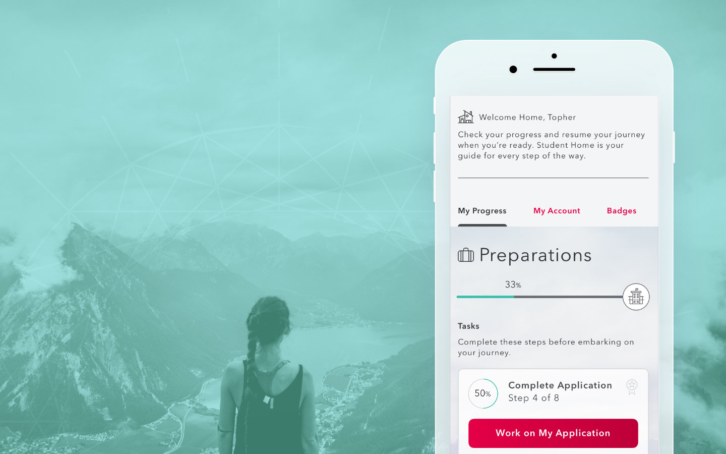
Student HomeApp Design

Door ConfiguratorDesktop Application