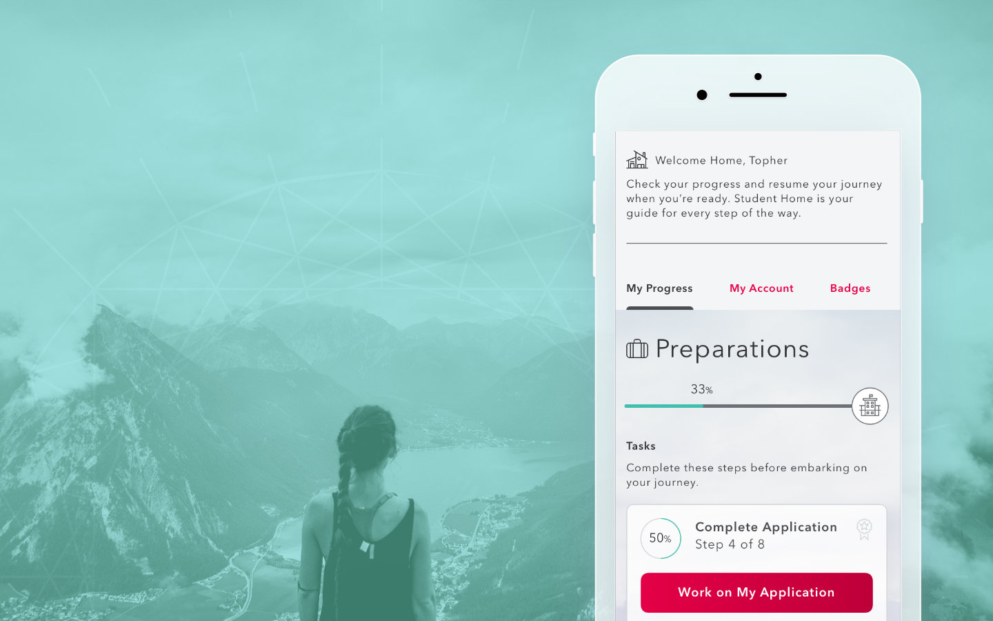
Student Home
Student Home
We wanted to give students a place where they would have a complete and confident understanding of their journey as they navigate their way through their online adventure.
We wanted to give students a place where they would have a complete and confident understanding of their journey as they navigate their way through their online adventure.
My Roles

Research

Art Direction

UI Design
UI Design
The Challenge
Finding Home
Students had to rely on email notifications and clunky message boards to keep up with class start times, grades, and resources. Why not give them a home to come back to everyday that would offer the most important information right at their finger tips?
Returning to Learning Experiences
I had the opportunity to come back to a company that supported learning experiences. It played a huge role in developing my skills as a designer. I joined their UX team during the development of a new e-commerce platform. While briefly supporting the team in completing the desktop version, I was primarily tasked with designing the mobile experience. Once completing the mobile e-commerce platform, I was then tasked with evaluating the product that accompanied it, the Student Portal.
E-commerce
This new platform would allow potential students the ability to choose, sign-up for, and purchase courses at their leisure making enrollment as simple as possible. My role would be to finish crafting the mobile version and maintaining this product and its pattern library in Sketch. I used Invision to hand-off the design to development for pixel perfect accuracy.
My Design Process
Discovery
While the design for the mobile e-commerce platform was completed and ready for handoff, the development was temporarily paused while our team was restructured. As the only remaining designer, I used this time to begin exploring the student’s experience using the Portal.
I started pouring over the student journey map and speaking to subject matter experts to understand the many tedious steps one person would go through in the process.

At this point I was overwhelmed and could well sympathize with someone on this path. There was a lot to take in and it felt like one giant slog of a process. We needed to help the student feel good about their decision to further their education not feel like “What have I done?”.
I thought a lot about how traditional schooling is very tangible. Some people even travel far away to attend a specific school. One day it hit me. "There’s no sense of adventure!". This would become a driving force in the way I would design for the student. Online education shouldn’t be a scary process, it should be an adventure!

Photo from unsplash used to inspire adventure. Would later be incorporated in the design.
Photo by Paul Gilmoreon Unsplash
I broke the student journey down in to three relatable sections of an adventure.


1. Prepare
First, “Prepare” or “Pack Your Bags”. This would cover everything from initial contact all the way to being accepted into your program.
2. The Journey
Next would be “The Journey”. Once you’ve packed and are ready to take classes, this area of the application would guide you along the way. Students would always know what classes are next and when they start. They could be notified by teachers, the school, or even other classmates.
3. The Destination
Finally, “The Destination”. Students could still utilize the app even after they’ve graduated. They would have access to plenty of resources for job seeking and a place to communicate with mentors or even become a mentor for future students.
Next I would begin to figure out the information architecture.
It needed to reflect how the student would navigate their journey and always display where they were along the way. There are so many steps and areas that students have to deal with so figuring out how to help the student feel in control was essential.

Mapping out the relation of each navigatable element
Design
Wireframes
I presented my findings with the e-commerce team of product managers and developers and we began to discuss possibilities, expectations, and realities. This helped to reign in the ideas and focus on what would become our MVP.


High Fidelity Mockups
Executive Level Management started taking notice of the project and were eager to see how this new product would look and behave. I began work using Sketch to design and Invision to build the prototype.


Conclusion
This was one of my favorite projects as a designer. Along with designing the mobile version of the e-commerce, I appreciated the opportunity to really immerse myself in the user's experience. I understood the painful process the user had to go through and was eager to find a solution that would help them enjoy their time as student.
Development was still underway as I departed the company in the summer of 2018. My sources have reported positive feedback through user testing from actual students who were eager for a streamlined and helpful tool to assist them on their journey.
Selected Works
Prison SimInteractive Learning Object
Glossary with Flip Cards Study Tool
Various UI DesignInteractive Learning Objects
Microsite - Faculty PlaybookMicrosite

Card GuruNew Brand and Website
Student HomeApp Design

Door ConfiguratorDesktop Application